Tuesday, November 23, 2021

Pine Cones and Needles


Thomas Watson Ball?
Francis 
Dana
Leonora of the Yawmish
New York: Harper & Brothers, 1897

This unsigned cover was issued by Harper while Thomas Watson Ball was working there as an art editor, what today would be called an art director. Although thin trees are a common element in his designs, along with a background hill, I hesitated to give an attribution. Many designs from Harper during his tenure there (1894-1900) look like he may have sketched them for others to execute, either staff artists or outsiders. We know The Mistress of the Ranch was Ball's design the same year, because that is in his portfolio, which is at the University of Rochester Library. It's the "Rosetta Stone" for TWB designs, and you can see every cover in it.


Thomas Watson Ball
Frederick Thickstun Clark
The Mistress of the Ranch
New York: Harper & Brothers, 1897

Ball generally did not use dots between words in a title, but he did so many variations of lettering that it doesn't mean it's not his. The style of lettering is similar on both of the above covers. The stylized pine cones and needles are a feature I hadn't seen on other TWB covers, but have seen on Lee Thayer's designs. Lee and Henry Thayer, the Decorative Deisgners firm, did many covers for Harper while Ball was there. That got me looking  through my catalogs  for designs with pine cones and needles. The first one I found was in the Second Exhibition


Thomas Watson Ball?
Samuel Merwin
The Whip Hand
Ills. by F. R. Gruger
New York: 
Doubleday, Page & Company, 1903

When I wrote the catalog description for The Whip Hand in 2009 this unsigned design reminded me of a Decorative Designers cover, perhaps by Lee Thayer. Today I wonder if this is another Ball, done the year that he was hired by Colgate as their art director. The lettering does have a TWB look to it. 

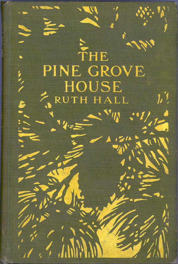
The Second Exhibition also had The Pine Grove House, an unsigned cover attributed to Lee Thayer [TBR #8 p. 13]. Here are two cover variants that internally appear to be on the same edition.


Lee Thayer
Ruth Hall
The Pine Grove House
Boston and New York: Houghton, Mifflin and Company, 1903

Although it's not pine cones and needles, a similar effect was created by Frank Hazenplug for his cover on San Isidro, done three years earlier, which was in the First Exhibition.


Frank Hazenplug
Mrs. Schuyler Crowninshield

San Isidro
Chicago & New York: 
Herbert S. Stone & Company, 1900

An entirely different style was used by Will Jordan, from the Second Exhibition:


William James Jordan
Herman Knickerbocker Viele
Myra of the Pines
New York: McClure, Phillips & Co., 1902

All the books in the Second Exhibition were acquired by the Lilly Library, Indiana University, Bloomington. The books in the First Exhibition were acquired by the Hoole Special Collections Library, University of Alabama, Tuscaloosa. The Thomas Watson Ball exhibition was acquired by the Eberly Family Special Collections Library, Penn State University.


Monday, February 22, 2021

1903 Covers by Thomas Watson Ball


In 1903 Thomas Watson Ball was hired as the Art Director for Colgate (until 1907), and his book cover lettering style follows the Art Nouveau logo he developed for their toothpaste. He used similar lettering for Robin Brilliant and Handicapped Among the Free, also incorporating Art Nouveau elements in the designs.

Handicapped Among the Free
by Emma Rayner
New York: Dodd, Mead & Company, 1903
Cover by Thomas Watson Ball

Robin Brilliant
by Mrs. Henry Dudeny
New York: Dodd, Mead & Company, 1903
Cover by Thomas Watson Ball


Tuesday, July 10, 2018

One More River, an Art Deco cover in transparent jacket

 
Here's a beautiful Art Deco publisher's binding that has an unusual dust jacket and presents many questions. One More River is the final installment of the trilogy "End of the Chapter", which  is the third trilogy of The Forsyte Saga. This is the American edition.

One More River
by John Galsworthy
New York: Charles Scribner's Sons, 1933
Beige cloth stamped in black and gold
In an acetate dust jacket with printed paper flaps

1. This is the first publisher's binding I have had with a clear dust jacket and printed paper flaps. The photo above shows it in the jacket. Many books have come in a glassine jacket, which is not as clear as this, and is more fragile. This feels like a plastic material, and I am advised by several people that it is most likely acetate. A similar style of jacket was used in 1930 by the Lakeside Press, Chicago for the limited edition of Moby Dick with Rockwell Kent illustrations, though that flap was not printed. It has a slightly rippled surface, which you can see when the light is at a certain angle.  The photo below is taken with a flash to get reflections from the texture:

Showing reflections from camera flash

The printed flaps are tipped onto the edge of the plastic about 1/16", likely glue, but I am not sure whether heat or a solvent could be used to melt the acetate to the paper. The plastic was then wrapped around the flaps so they are fully enclosed, then wrapped around the book:

The transparent dust jacket with flaps. The color behind the plastic is the scanner pad.

The attachment of the acetate to the back of the dust jacket flap.

Following an inquiry to the exlibris listserv I received an email from Alan Tannenbaum, indicating that this type of dust jacket was patented in England in 1929 (Pat. GB330781) by Lewis George Kitcat, master bookbinder from the House of Kitcat. In a followup he sent me patent images and text, and an article in The Carrollian | The Lewis Carroll Journal [No. 22, Autumn, 2008] by him and Selwyn Goodacre titled "Macmillan's Ledura Bindings with Transmatic Dust Jackets." The article describes four Carroll books issued in this sort of jacket, and he adds eight British publishers who used this form of jacket between 1925 and 1939. 

There is no indication on our Scribner edition that this was licensed from the British patent, and I am now trying to determine whether the British patent secured any American rights, and if this Scribner form of the jacket is identical to the Kitcat patent, or whether the method of attaching the paper flap is different enough that it was not infringement. The patent indicates celluloid as a material, but is careful not to limit it to that.

The dust jacket has preserved the brightness of the gold.  The book was published at the bottom of The Great Depression, and it is not genuine gold.  You wouldn't know that from looking at this copy, but I have another copy where the "Japan gold" (a bronze or brass leaf) has oxidized and darkened.

2. What edition is this? Normally a fancy cover is put on a first printing of a first edition, and plain covers often come later. But this edition does not have a capital A on the copyright page, a convention used by Scribner's on first editions after 1930 until the 1970s. There are dozens of copies of this book available online, identified as "first edition" with the A on the copyright page. Those copies have plain purple covers. In other respects this edition is the same, with 1933 on the title page. The text on the dust jacket flaps is the same, though on orange paper for this edition. Perhaps it was a holiday gift book edition. I'm looking for advertisements with pictures of this cover. If you see one, please let me know.

***UPDATE November 4, 2019: I just acquired another copy in this cover design, and it has the "A" on the copyright page. Apparently both bindings were simultaneously available on the first printing, and also on at least one later printing. That makes it even stranger that this design is scarce.


3. There is no monogram or other identification of the cover artist. The Art Deco lettering and decorative elements surround an abstract pictorial that resembles a woodcut. I have not yet identified the artist, though at that time Art Deco woodcut masters Rockwell Kent and Lynd Ward were doing work for Scribner's. Here it is without the plastic dj:

The cover and spine.

If you think the clear plastic dust jacket is a later addition where someone cut the flaps and added them, I learned about it from John Lehner, who has one that is identical. There are very few copies with this design showing on the Internet.

Scan with the cover closed, no dust jacket.

Wednesday, March 14, 2018

A Dealer has Some Nice Bindings

I just bought a few books from Ron Lieberman of THE FAMILY ALBUM, ABAA. He has posted many in albums that you can view on the Internet.  Even if you are not buying, there are a lot of interesting covers to see, many of which have been in my exhibitions. Here are the links:

https://photos.app.goo.gl/vx9jR7uVHH5DHvh53
https://photos.app.goo.gl/8n4vrDL0aELgSvlx2
https://photos.app.goo.gl/djVkGCDGnqOyB8D23
https://photos.app.goo.gl/xzirRHfOltoGj3V33
https://photos.app.goo.gl/eY6grwbnweMEEqzs2
https://photos.app.goo.gl/sugfVDEueNzYnhEw1
https://photos.app.goo.gl/9VBJZzXYNBXhBJI03

If you see something you like, contact him: Rarebooks@POBox.com

Thursday, November 30, 2017

A newly discovered cover by Thomas Watson Ball


Thanks to Prof. Ina Saltz of the City College of New York, who recognized Ball's lettering style on a copy of this book in the CCNY Library. 

Thomas Watson Ball
Doris
Kingsley by Emma Rayner 
New York: G. W. Dillingham Company
n.d., copyright 1900, 1901

Some research still needs to be done on this edition. It is scarce, with only ten library copies listed in WorldCat. Not all of those are in the original binding.  The design incorporates the "flaky" white common to this period. See the September 6, 2009 post for more about the use of white on covers at that time.

Ball did this for Dillingham the same year as A Master of Fortune, another maritime scene that also used the flaky white.  It's not as scarce a book as Doris Kingsley, but is hard to find with all the white intact. I had a nice copy that was protected by the original dust jacket in the Second Exhibition of American Decorated Publishers' Bindings 1872-1929 (2008):

Thomas Watson Ball
A Master of Fortune
by Cutcliffe Hyne
New York: G. W. Dillingham Company
n.d., copyright  1901

Dillingham used lighter cloth and deleted the white stamping on later copies. That year they also had T. W. Ball do the cover with flaky white for Norman Holt, see the blog post of August 31, 2016.
 

Wednesday, January 18, 2017

Books for Sale with Interesting Covers

  
Whether or not you want to acquire them, you might enjoy seeing some publishers' bindings from my collection that are available for purchase. Click the cover to download a PDF of about 4 MB.

http://minskyreport.com/Catalog117.pdf


Wednesday, August 31, 2016

More covers by Thomas Watson Ball


We can deduce from the lettering style, panelization, publisher and date that T. W. Ball designed the cover of Janice Meredith, which includes a paper onlay of a woman, likely not by Ball.  The onlay is somewhat unusual in that it bears the notice "COPYRIGHT 1899 BY P L FORD" (see detail below). Was Ford claiming rights to the image, or the cover design as well as the text? The normal copyright notice is on the verso of the title page.

Janice Meredith
New York: Dodd, Mead and Company, 1899 

 Enlarged detail of the onlay

Grosset & Dunlap released a Photoplay edition in blue cloth illustrated by stills from the 1924 film starring Marion Davies in the title role, replacing the original onlay with a reproduction of the image from a poster featuring the actress in the role. The lettering was slightly reworked as well. Look carefully at the author's name, and how the curlicue at the foot of the "L" is shortened so it no longer breaks the bottom line of the border. Then look at the slight differences of the other letters, all somewhat cruder and less lyrical than the original TWB lettering.

Janice Meredith
by Paul Leicester Ford
New York: Grosset & Dunlap
Undated Photoplay edition, ca. 1924

The distinctive Ball ampersand, first noted by Sue Allen, and the peculiar Ball "R" distinguish the lettering of Jimty & Others, and similar stylized flowers appear on other Ball covers. This was done during Ball's 1894-1900 tenure as an "art editor" (would now be called "art director") at Harper's.

Jimty, and Others
Illustrated by W. T. Smedley and A. B. Frost
New York and London: Harper & Brothers, 1898

The striated sky and silhouette soldiers identify Norman Holt as Ball's work, along with characteristic lettering and his "by".


Norman Holt
Illustrated by John Huybers and Seymour M. Stone
New York: G. W. Dillingham, n.d., c 1901

As always, thanks go to the indefatigable bibliomaniac John Lehner, with whom I correspond frequently. Since 2004 we have exchanged 10,000 emails on the subject of publishers' bindings. Yes, ten thousand!